the part of design that is the most fascinating to me (more than type) is branding or identity design. through this all aspects of a project or a compay have elements that connect it all together. going through my album artwork in itunes, i realized many artists make their singles or EPs relate back to the full length album that preceeded them. here are a few of my favorite album brands that i have seen:
Air - Pocket Symphony / Once Upon A Time / Mer du Japon


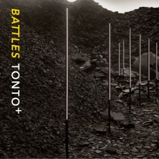
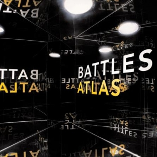
Battles - Mirrored / Tonto / Atlas

Daft Punk - Human After All / Robot Rock / Technologic / The Prime Time of Your Life


%5CDaft%20Punk%20-%20Technologic.jpg)

Hot Chip - The Warning / Over and Over / Boy From School / Colours


M83 - Before the Dawn Heals Us / Don't Save Us From The Flames / A Guitar And A Heart / Teen Angst


Mylo - Destroy Rock & Roll / Doctor Pressure / In My Arms / Paris Four Hundred


%5CMylo%20-%20In%20My%20Arms%20(CD5).jpg)

Soulwax - Nite Versions / NY Excuse / E-Talking / Any Minute Now


enjoy.


4 comments:
Belle and Sebastian and the Smiths also make all their singles/EPs/LPs match in artwork. Smiths and Morrissey albums always have the title in quotations, too, which is kind or weird. Except for Ringleader of the Tormentors, and I don't know why.
if you scroll down fast using your arrow key, some of those designs do weird things to your eyes
Nice. BTW, join the revolution...
http://www.regrettablemusic.com/
yeah my eyes hurt a bit.
but these are incredible!
Post a Comment